
Uptown Bingo
This page is still under construction.
Some content will be different from the real game because I review my part of the game
All images copyright by GamePoint.
Some content will be different from the real game because I review my part of the game
All images copyright by GamePoint.
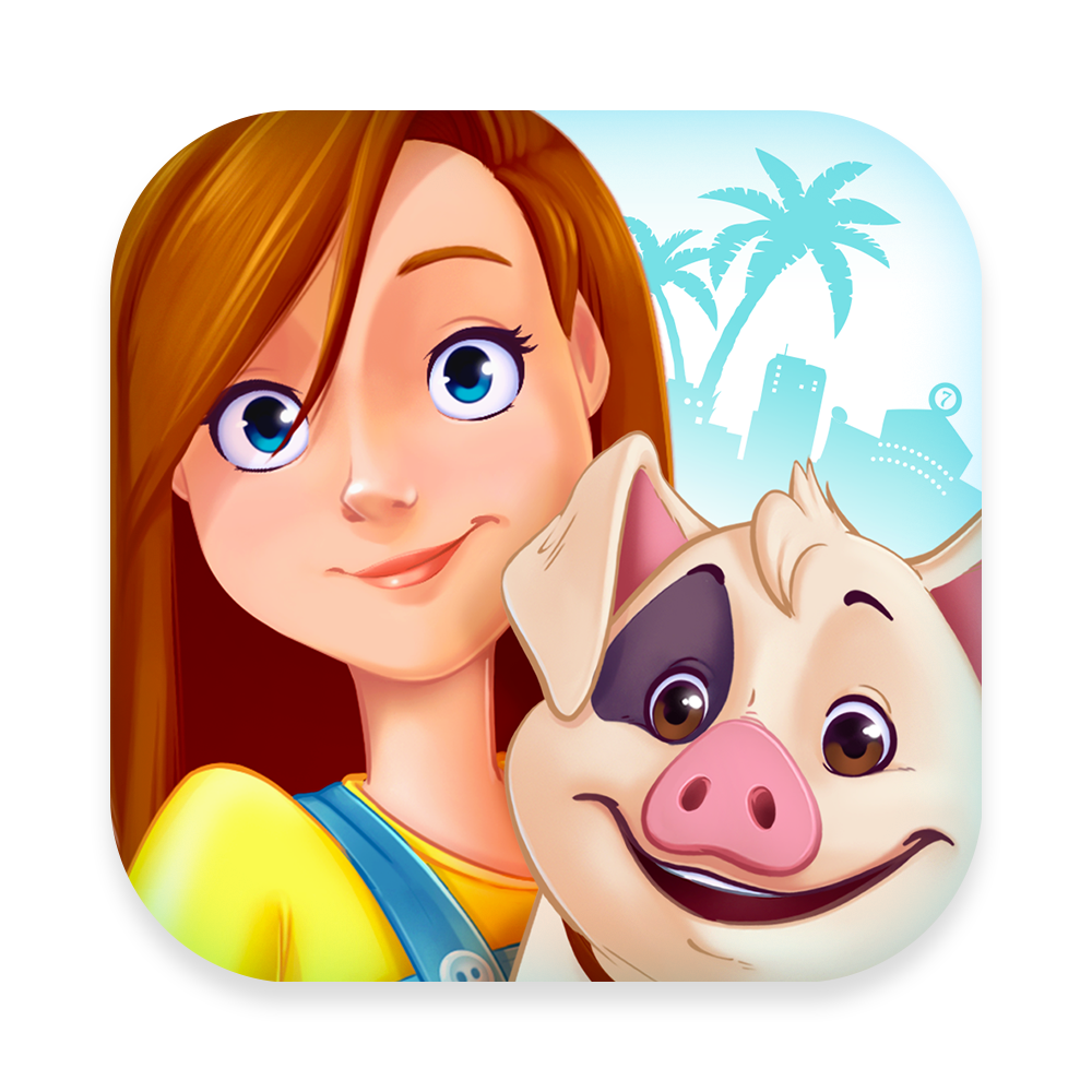
Uptown Bingo App icon © GamePoint 2020,
Introduction
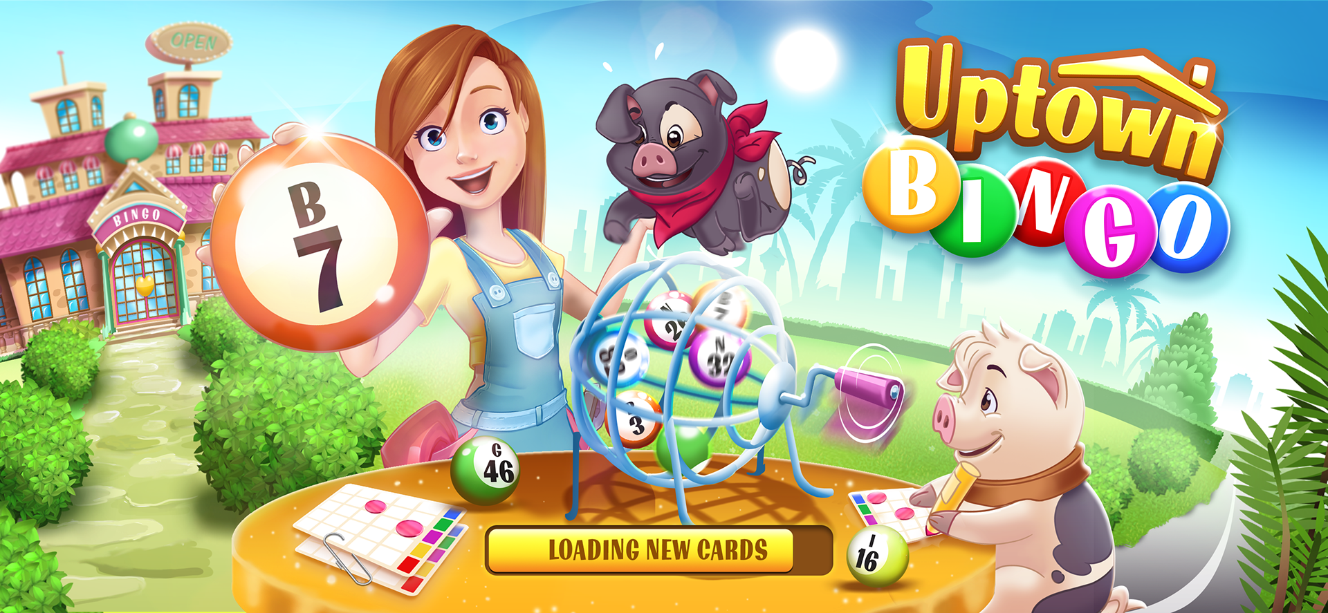
Uptown Bingo is a multiplayer social casual casino game made by GamePoint. Justin Zant, a young but brilliant game designer, designed this game. I was involved in this project as UI/Graphic Designer. Although I'm not responsible for all the art, the style and feeling of the game came from my hand. Sebastian Reinarz (former Art Director EA, tons of other games) , the manager of Art & Design, gave me the opportunity to go wild for this game. Together we thought of which approach this game needs. This game should be a 'triple AAA' game which have to compete with the top BINGO games out there. With art direction of Sebas and a clear briefing this beautiful game is ready to shots fire.
GamePoint has a lot of experience with Bingo games, but this one is different. Beside the side story, which is a big meta game, it has also a huge meta game similar to games like 'The Sims'. I was not involved from the beginning, my job started after the planning, sketching and wire framing the game. This means the blueprint was already on the table. First another designer took an gameshow approach, along the way this style just did not fit perfectly for the game. When I took the approach I felt that this game needs to be in a VERY WARM environment. How I came up to this unique style, you will read later. NOTE: Not all art on this page is created by me. I took some assets of other members of the team to create some creatives.
The Story
Olivia (drawed by Maura Hill) is our main character. She is a 30 old single woman who gonna start a new life after a divorce. She bought an old crappy big hall. By starting a 'Bingo Hall' called Lucky Palms in the Uptown of the city she hopes to start her new life and dreams. But when she arrives with her two cute piggies 'Salt & Pepper' she sees that the place is a mess. It is to you -the player- to help her renovate, decorate and cleaning this place. You can't do this all by yourself? Start making friends in town!
Trailer of the game. Made by Dave Damwijk, Sytho Holwerda and Maura Hill. © GamePoint 2020,
Now if you read the story, you can almost taste the feeling. I had instantly the feeling of the game by reading this story. Olivia is a very easy going woman who is very handy. She had no time in her life to be this creative as she is now. It is time to work! Woodcraft, painting, cleaning, palm leaves, sunny, happy place. These words needs to be in the style.
Everybody loves the always smiling Olivia, she SHINES! This means everything in the game needs to be positive. Sunshine, blue sky, cute animals en 'a-lot-of-colors'. This game basically has 2 sides. The one is outdoors, think of Blue/Light/Outside and the other one is inside think of Brown/Old/Dark. These two faces needs to combine to create a perfect atmosphere. All ingredients to use a nice color scheme.
Everybody loves the always smiling Olivia, she SHINES! This means everything in the game needs to be positive. Sunshine, blue sky, cute animals en 'a-lot-of-colors'. This game basically has 2 sides. The one is outdoors, think of Blue/Light/Outside and the other one is inside think of Brown/Old/Dark. These two faces needs to combine to create a perfect atmosphere. All ingredients to use a nice color scheme.
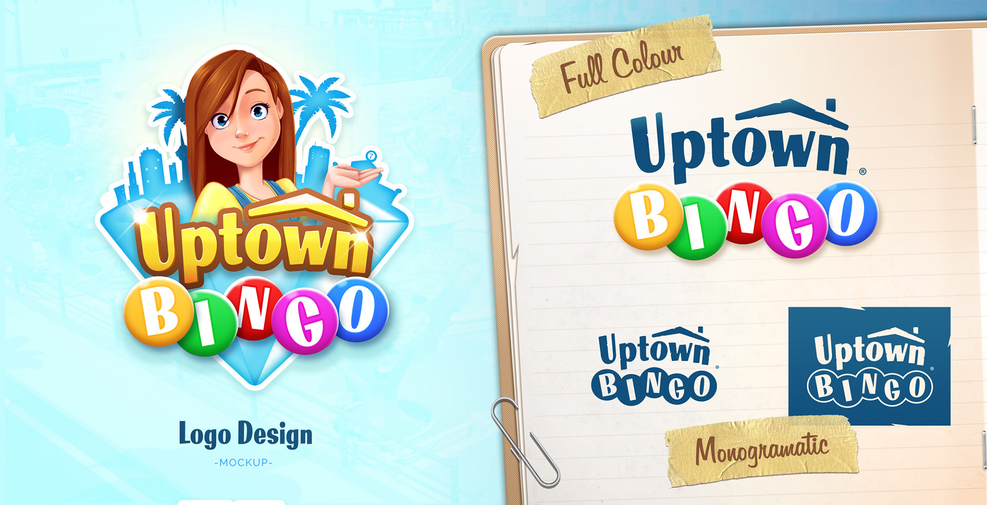
Uptown Bingo Logo © GamePoint 2020, Author: Lennart Poort
Logo
"The logo is fun." "The overal ratio is perfectly 4:3." "It is a pleasant shape to see." These sentences should apply by building the logo for this type of game. The Uptown Bingo logo is divided in 2 parts. You got the Uptown part which needs to represent the big meta gaming. Building, redecoration and owning the The Big Bingo Hall. As you watch closely. You will see the Uptown has some spikes in the word. This stands for the woodcrafting as well as the palm leaves of Lucky Palm. You also see a roof with the letters 'OWN'. This mean you 'OWN' this. You are the center of Uptown. There is a little easter egg in this logo as well. If you are a little creative, you can imaging the chimney as the dot for the i. This will show the word WIN.
So Uptown bingo you can divide in . 'UPTOWN', 'UP', 'TOWN, 'OWN' and 'WIN'. All of this is positive.
Palm Style
One of the strongest style I applied to this game is the so called Palm Style. You will see this in a lot of assets of the User Interface in this game. This seperate the style mainly from any other style out there.
One of the strongest style I applied to this game is the so called Palm Style. You will see this in a lot of assets of the User Interface in this game. This seperate the style mainly from any other style out there.
Why and what is Palm Style?
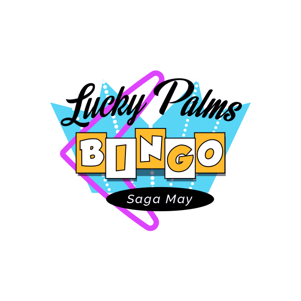
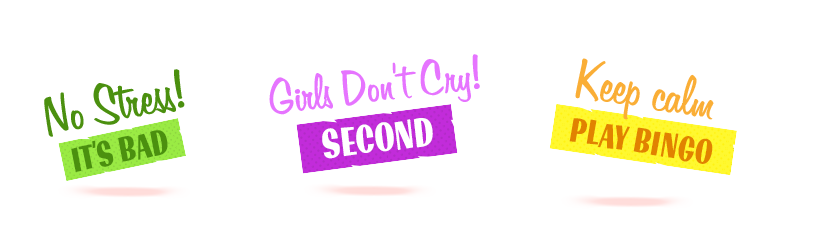
It is a term I came up for. It is an Urban Jungle style. It feels crappy, selfmade, woodcraft, but it feels also the person who created it, took time for this. See it as the proud shed of the man in the house. It is not like the Gamma or Praxis, but it works. As Olivia needs to fix this place, we want to give the player the feeling she has made it ALL by herself. You see a lot of fixing tape also. You will see this style in Bingo Cards, her Notebook, all overlays, frames. It's all feels self constructed but nice. With a slight hint of palmtree's Miami this game have a own style.
It is a term I came up for. It is an Urban Jungle style. It feels crappy, selfmade, woodcraft, but it feels also the person who created it, took time for this. See it as the proud shed of the man in the house. It is not like the Gamma or Praxis, but it works. As Olivia needs to fix this place, we want to give the player the feeling she has made it ALL by herself. You see a lot of fixing tape also. You will see this style in Bingo Cards, her Notebook, all overlays, frames. It's all feels self constructed but nice. With a slight hint of palmtree's Miami this game have a own style.
Uptown Bingo Loadingscreen © GamePoint 2020
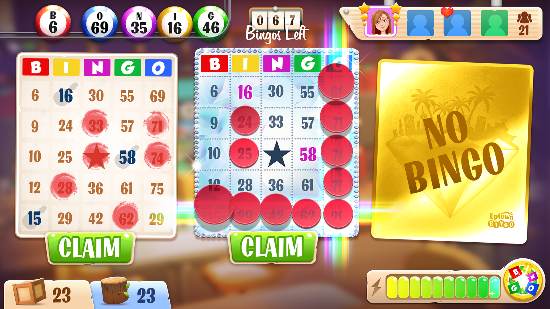
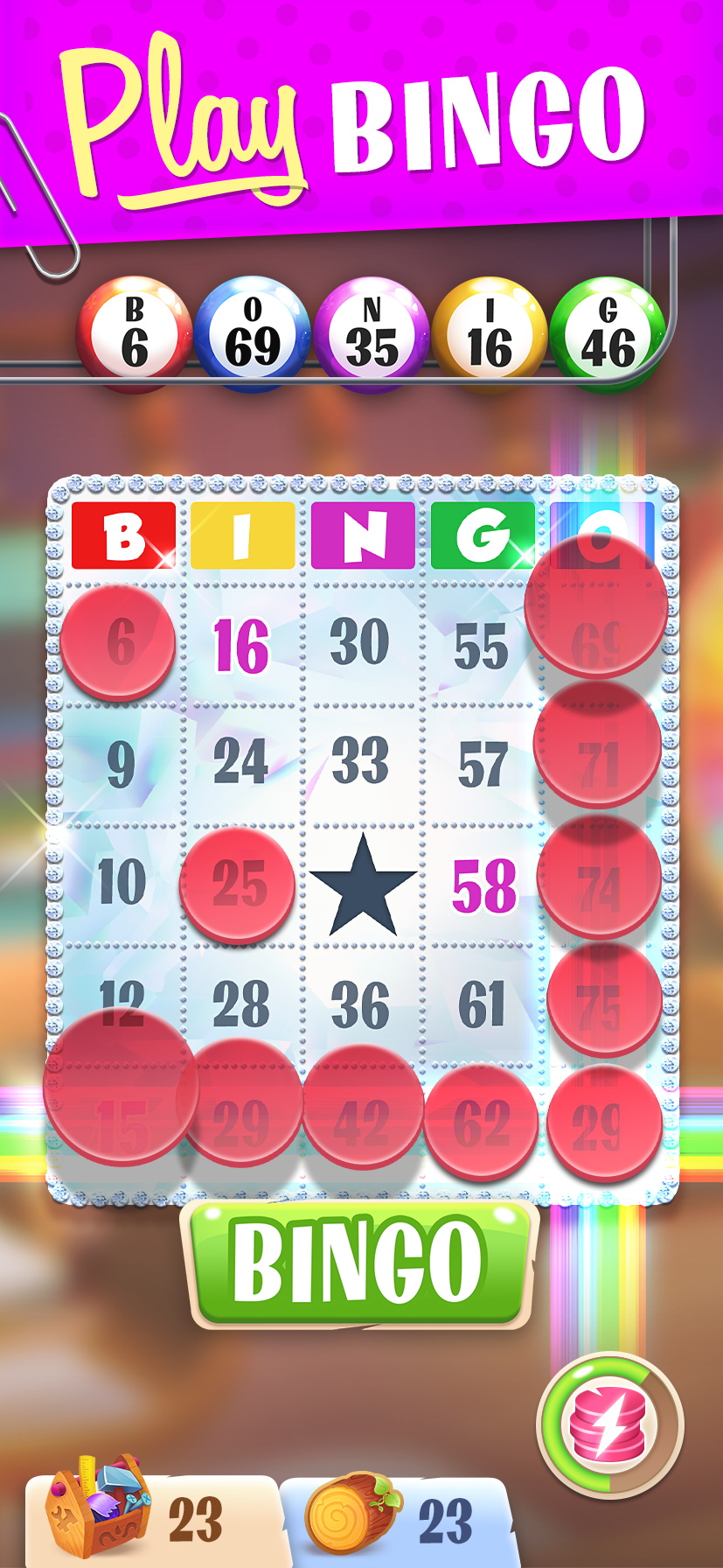
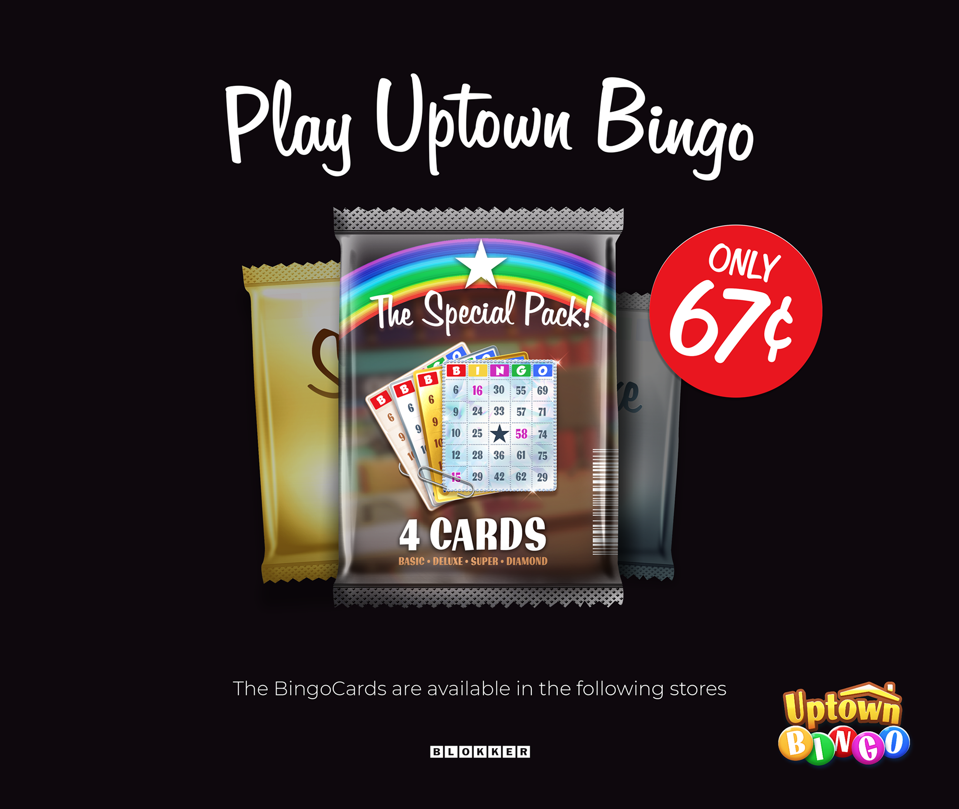
Bingoballs & Bingocards
To clarify something, this is a Bingo game. We all know what Bingo is, it needs to be simple and clear. Does not matter how wild you go with a game it always needs to be CLEAR. So if you designing 'Bingo balls' or 'Bingo cards' you know what the focus should be. Yes, you're right. It needs to be clear. The numbers needs to be on top with a hard contrast. WATCH OUT! If you go to high on contrast it because less readable. Find the perfect balance. We have, thus far, 4 different style of bingo cards. This means every card should have the perfect balance between numbers and background. This was a hard thing to do, but we managed it perfectly.
To clarify something, this is a Bingo game. We all know what Bingo is, it needs to be simple and clear. Does not matter how wild you go with a game it always needs to be CLEAR. So if you designing 'Bingo balls' or 'Bingo cards' you know what the focus should be. Yes, you're right. It needs to be clear. The numbers needs to be on top with a hard contrast. WATCH OUT! If you go to high on contrast it because less readable. Find the perfect balance. We have, thus far, 4 different style of bingo cards. This means every card should have the perfect balance between numbers and background. This was a hard thing to do, but we managed it perfectly.
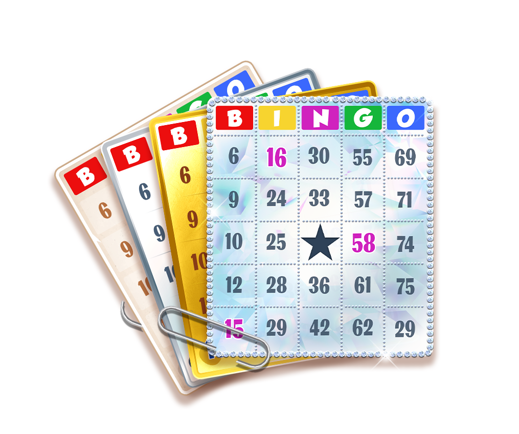
Bingo Cards I've designed © GamePoint 2020
Nice example of Palm Style text styles.
Now designing the Bingo Balls is a different story. As they need to be as clear as the cards, the balls needs to be unique as well. Because there are hundreds of Bingo games out online, people needs to recognize the game by the style of the ball. As I liked more the simple balls (1 color), it made hard to reed. We desided to go for the POOL bingo ball. Black on white is easy to reed and the number stands on it own of the color. Important part of the ball is to keep the font the same as the font on the card. First we went for a standard font on the balls which did not correspond with the numbers on the card. This made it very hard to search if you have the ball called.
Bingo balls Study © Sinisters.nl 2020
The Colors
If you played some online Bingo, you might agree with me that Bingo is always so color full. I think that is the power of this game. In real-life bingo the most important value of the game is the hosted 'CALLS' the balls. You won't see that moch color in Real-life bingo. As for online Bingo the most important value is to 'SEE' which ball has called. That is why you will see the extremely color palettes of bingo. I tried to create a color palette which won't affect the reading of the balls. So you basically tone down the colours a bit, because you want the cards and balls to stand out much more.
If you played some online Bingo, you might agree with me that Bingo is always so color full. I think that is the power of this game. In real-life bingo the most important value of the game is the hosted 'CALLS' the balls. You won't see that moch color in Real-life bingo. As for online Bingo the most important value is to 'SEE' which ball has called. That is why you will see the extremely color palettes of bingo. I tried to create a color palette which won't affect the reading of the balls. So you basically tone down the colours a bit, because you want the cards and balls to stand out much more.
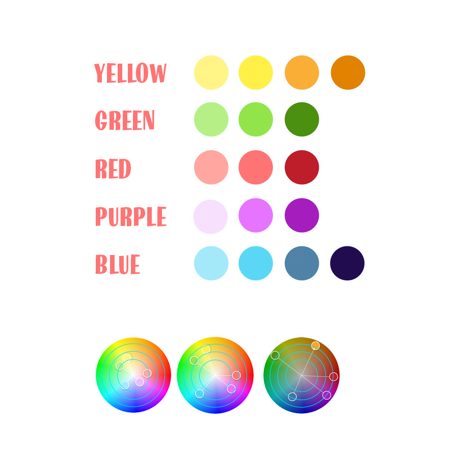
Color Study © Sinisters.nl 2020
Concept of interface I made © GamePoint 2020
Concept of interface I made © GamePoint 2020
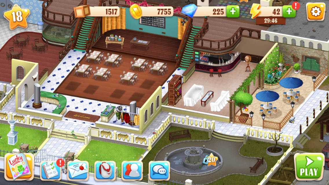
Metagaming
A big part of the game you are decorating, building stuff for your Bingo Hall. I have to say, I did not do any of this. Jelmer & Sytho did this part. they did this extremely good. It is fun to be in this atmosphere and you keep wanting more stuff and thus you need to play much more. This is a small part of the giant building in a giant city.
If you keep expanding your clubhouse you will be able to create more items which you can please your guests more and more. At some times you need to kick your customers out because they like it too much.
In-Game Screenshot (iOS) Source 'Uptown Bingo' game.
Design Team: Justin Zant, Sebastian Reinarz, Sytho Hollema, Olgu, Sander Ottens, Jelmer de Groen, Maura Hill and many more